ROC Curves, Efficiency and Purity: The Same Idea in Two Languages
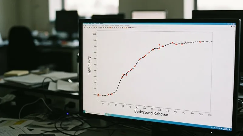
If you have spent any time cutting on a discriminant variable — choosing where to place a signal box, deciding how tight to make a lepton isolation requirement — you already understand ROC curves. The terminology just changed when the idea crossed into computer science, and that small language barrier can make a familiar concept look foreign. This article maps the two vocabularies onto each other and shows you how to read and use ROC curves in practice.
The Physics Picture You Already Have
When you place a cut on some observable, you are making a trade-off. Tighten the cut and your sample gets purer — more signal, less background — but you lose some signal events along the way. Loosen it and you recover efficiency, but background leaks in. You cannot have both simultaneously, and the shape of that trade-off is determined entirely by how well the observable separates signal from background.
Physicists usually summarise this with two numbers: signal efficiency (ε_S, the fraction of true signal events that pass the cut) and background rejection (1 − ε_B, the fraction of background events that are removed). You can also frame it as signal efficiency versus background efficiency, or signal efficiency versus purity, depending on what your analysis needs. These are all different views of the same underlying trade-off curve.
What a ROC Curve Actually Draws
A ROC (Receiver Operating Characteristic) curve sweeps the cut threshold from one extreme to the other and plots, at every threshold, the true positive rate on the y-axis against the false positive rate on the x-axis. Translate those terms directly:
- True positive rate = signal efficiency = ε_S
- False positive rate = background efficiency = ε_B = 1 − background rejection
So the ROC curve is the signal efficiency vs. background efficiency curve, tracing out every operating point your discriminant can reach. The closer the curve bends toward the top-left corner — high signal efficiency with low background efficiency — the better the discriminant is doing its job. A diagonal straight line from bottom-left to top-right is a useless discriminant: signal and background are indistinguishable, so any cut lets through exactly as much background as signal.
Some HEP papers instead plot signal efficiency vs. background rejection (1 − ε_B). That curve bends toward the top-right corner instead. Both are ROC curves in spirit; only the axis convention differs. If you are comparing plots from different papers or software packages, check the axis labels first.
The AUC: One Number for the Whole Curve
The Area Under the Curve (AUC) condenses the ROC curve into a single scalar. A perfect discriminant has AUC = 1; a random one has AUC = 0.5. In particle physics terms, a higher AUC means the discriminant does a better job across all possible operating points — it is a summary of the overall separation power, not tied to any specific cut value.
AUC in particle physics is useful for ranking models during development. If model A has a higher AUC than model B, then model A offers a better efficiency-versus-rejection trade-off somewhere. But AUC is not the right number to quote in your analysis result. Your analysis will run at one operating point, and that point is chosen by physics requirements — a target signal efficiency, a maximum background contamination, or a desired significance. The AUC helps you pick the best model; the ROC curve at your chosen working point tells you what you actually achieved.
Reading ROC Curves in Practice
Step 1: Identify your working point first
Before you look at a ROC curve, decide what your analysis requires. Is signal efficiency the constraint (you need a minimum ε_S to keep statistical power)? Is background rejection the constraint (a maximum ε_B for your background estimate to be reliable)? Write that requirement down before you start comparing models.
Step 2: Read off the operating point
Find your requirement on the appropriate axis and read across to the curve. The corresponding value on the other axis is what that model delivers at your working point. If two models have similar AUC but one performs much better right at your working point, choose that one — global AUC is not the goal, physics performance at your cut is.
Step 3: Compare curves, not just AUC numbers
Two ROC curves can cross. Model A might be better at high signal efficiency while model B is better at high background rejection. If your analysis lives at high efficiency, choose A even if B has a marginally higher AUC. Always plot the full curves when comparing classifiers.
Step 4: Check for overtraining
A dramatic gap between the ROC curve evaluated on training data versus test data is the ML equivalent of overfitting a chi-square to statistical noise. Your model has memorised the training sample and will not generalise. Cross-validation or a held-out test set is the standard check. Our full curriculum covers validation strategies in depth, as does the free introductory module.
Connecting ROC Curves to Purity
Purity (or precision) — the fraction of selected events that are genuinely signal — depends not only on ε_S and ε_B but also on the signal-to-background ratio in your sample. The ROC curve does not show purity directly because purity is sample-dependent. Once you know your working point from the ROC curve, you can compute purity for your specific sample composition. This is worth remembering when you read ML papers that quote AUC: the same model can deliver very different purities in a 1:1 signal-to-background sample versus a 1:1000 one.
If you want to dig further into how these ideas fit into a full analysis workflow — from feature engineering to model selection to systematic uncertainties — the complete course covers each step in a particle physics context.
The ROC curve is not a foreign object: it is the efficiency-versus-rejection trade-off you already draw, put on axes a computer scientist chose — once you see that, you can read any ROC plot in the literature and use it for exactly what your analysis needs.
Want to go deeper?
Machine Learning for High Energy Physics: The Complete Course takes you from first principles to a defensible result in 6 structured modules. $97, 30-day guarantee.
See the course →Not ready yet? Grab Module 1 free →